
Tuesday, February 11, 2014
Fighting Ignorance - A Tribute to Hans Rosling
The Gapminder Foundation has a stated mission ‘to fight devastating ignorance with a fact-based worldview’. By making data available, and more importantly accessible through interactive visualizations, Hans Rosling brings to life statistics that might otherwise languish in the appendix of an almanac. We pay tribute to the work Hans has done by visualizing an educational dataset (sourced from Gapminder) showing the tremendous educational gains made around would in the past 40 years. View regional performance or choose a region to drill into individual countries. Understand educational inequality trends by comparing the average male education vs female education over time plotted against a 45 degree line. In quintessential Hans style, check out the histogram view that changes over time and can be adjusted via the year selector.

Saturday, January 18, 2014
Creating a 45 Degree Reference Line in a Tableau Scatter Plot (without SQL!)
In situations where it is logical to make this comparison, a simple 45 degree line on a scatter plot can show how close or far the points are to parity. While working on my Hans Rosling - Fighting Ignorance viz, I wanted to include a reference line to help users understand educational inequality between genders. Below I've outlined the steps used to create this reference line in Tableau without using any SQL.
We begin with a scatter plot showing male education on the X axis and female education on the Y axis. At a glance, it is hard to tell how close the average male education compares to the average female education:
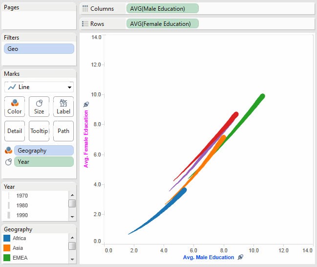 |
| Our starting point - while this chart provides some insight, the gender education inequality is not obvious. |
The first step is to create a calculated field that will be plotted as the reference line. I will title it 'Reference Line'. We are going to make it equal to Male Education so that at any point X the value for this field will be X:
 |
| By creating a field equal to male education we can plot it on the male education axis resulting in a simple 45 degree line. |
Next we add the newly created calculated measure to Rows and right click to set it as 'Dual Axis' so both the educational data and reference line are on the same chart. Note that due to Tableau defaults, it colors and formats the reference line data just like the educational data. We'll be correcting that shortly!
 |
| Tableau defaults the reference line formatting to match that of education data so it is segmented by size (year) and color (geography). |
Tableau defaulted the Reference Line field to Sum so we need to adjust it back to Average:
 |
| This ensures the line is at the same scale as the educational data. |
Because we want to compare apples-to-apples between our data points and reference line it is critical we synchronize the axes between the data and reference line or otherwise we'll mislead the user:
 |
| It is essential the axes are synchronized, otherwise users will be misled. |
Now we need to format the reference line by taking several actions. First remove the color and size variation for geography and year. Second, to increase the range of the line, we need to increase the granularity of the data so I have added the country dimension ensuring that no matter how the chart is filtered by the user, the line reaches from the lowest point to the highest. Lastly, we change the color from the default light grey to black so that it is more visible on the chart:


We must remember to clean up the default tooltip generated by Tableau. I have removed all of the variables and given it the description "Reference Line - Avg. Male Education = Avg. Female Education". I also removed the command buttons as they do not serve a purpose on the reference line:
 |
| Remove the default text and provide a description to help your user understand the significance of the line. |
Finally we hide the second axis and our new and improved scatter plot chart with a 45 degree reference line is complete! It is now easy to see which geographies and countries have near parity between male and female education and which ones have a large gender gap.
 |
| With the reference line in place, it is now apparent that most geographies are nearing gender educational equality while Africa has diverged further from educational equality. |
Thursday, January 9, 2014
3 Minute Win - San Francisco Food Trucks
One of the features Tableau is known for is the speed at which users can build insightful visualizations. The "3 Minute Win" competition hosted by Tableau challenges users to create a viz in under three minutes to show the power of the standard functionality.
For my entry I decided to combine my love of food with data publicly available from the city of San Francisco. I found an interesting data set of 'mobile food facility permits' (a.k.a. Food Trucks). Applicants must declare what items they intend to sell as part of the application process, as well as which locations they plan to operate. By leveraging the parameter functionality within Tableau and some basic filtering capabilities, I show how easily one can pull up a map of the locations serving your favorite food.
Take a look below:
Wednesday, November 20, 2013
Dreamforce Social Listening Post
My Dreamforce social listening dashboard gives users an at-a-glance view of the major trends and key conversation influencers at Dreamforce. To address the popularity of the official hashtags, I looked at a logarithmic view of the top hashtags and utilized a bubble chart showing the tweet count (size) and retweet percentage (color). The influencers section identifies the top tweeters and indicates how popular their tweets were (identified via retweet). Check out the TwitPic tab for a fun view of the many photos captured at the event!

Tuesday, September 3, 2013
The Increasing Cost of Healthcare
Visualizing Medicare data revealed several interesting financial aspects of our healthcare system. By viewing the state and classification heat map, it is apparent that California, Nevada, and New Jersey have the highest average costs. It is especially odd for New Jersey given its proximity to Maryland, which has the lowest state costs. Also interesting is the scatter plot of Diagnosis Related Group (DRG) codes, which reveals several outliers in terms of cost and patient volume. Public health administrators looking to bring down costs could use this visualization to identify procedures with the highest costs and frequency that would most benefit from efficiency improvements.

Subscribe to:
Posts (Atom)