In situations where it is logical to make this comparison, a simple 45 degree line on a scatter plot can show how close or far the points are to parity. While working on my Hans Rosling - Fighting Ignorance viz, I wanted to include a reference line to help users understand educational inequality between genders. Below I've outlined the steps used to create this reference line in Tableau without using any SQL.
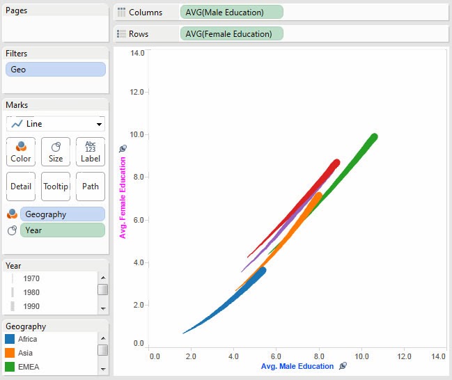
We begin with a scatter plot showing male education on the X axis and female education on the Y axis. At a glance, it is hard to tell how close the average male education compares to the average female education:
 |
| Our starting point - while this chart provides some insight, the gender education inequality is not obvious. |
The first step is to create a calculated field that will be plotted as the reference line. I will title it 'Reference Line'. We are going to make it equal to Male Education so that at any point X the value for this field will be X:
 |
| By creating a field equal to male education we can plot it on the male education axis resulting in a simple 45 degree line. |
Next we add the newly created calculated measure to Rows and right click to set it as 'Dual Axis' so both the educational data and reference line are on the same chart. Note that due to Tableau defaults, it colors and formats the reference line data just like the educational data. We'll be correcting that shortly!
 |
| Tableau defaults the reference line formatting to match that of education data so it is segmented by size (year) and color (geography). |
Tableau defaulted the Reference Line field to Sum so we need to adjust it back to Average:
 |
| This ensures the line is at the same scale as the educational data. |
Because we want to compare apples-to-apples between our data points and reference line it is critical we synchronize the axes between the data and reference line or otherwise we'll mislead the user:
 |
| It is essential the axes are synchronized, otherwise users will be misled. |
Now we need to format the reference line by taking several actions. First remove the color and size variation for geography and year. Second, to increase the range of the line, we need to increase the granularity of the data so I have added the country dimension ensuring that no matter how the chart is filtered by the user, the line reaches from the lowest point to the highest. Lastly, we change the color from the default light grey to black so that it is more visible on the chart:
We must remember to clean up the default tooltip generated by Tableau. I have removed all of the variables and given it the description "Reference Line - Avg. Male Education = Avg. Female Education". I also removed the command buttons as they do not serve a purpose on the reference line:
 |
| Remove the default text and provide a description to help your user understand the significance of the line. |
Finally we hide the second axis and our new and improved scatter plot chart with a 45 degree reference line is complete! It is now easy to see which geographies and countries have near parity between male and female education and which ones have a large gender gap.
 |
| With the reference line in place, it is now apparent that most geographies are nearing gender educational equality while Africa has diverged further from educational equality. |


John,
ReplyDeleteThanks so much for this tutorial. This was the only place on the web I could find that described exactly how to do what I needed to do on my viz. Amazing that something so simple isn't built in.
Hi,
ReplyDeleteThanks for publishing this. This was very helpful. I just have one question though. So my data doesn't extend all the way from 0 to 100, and so when I use this method the line ends up getting cut off in the middle. I would like my reference line to extend all the way from the origin to 100. Is there an easy way to add an extra step to the above method to fix this?
Thanks.
Great article! Another option is to create an annotation point with no text. Stretch the arrow and replace the arrow head with a large dot.
ReplyDeleteGreat post - just used this for a project i'm working on.
ReplyDeleteHow can i use your method to add two reference lines. Say one at 45 degrees or 100% or one that is about 70%.
ReplyDeleteGreat Help thanks for sharing!
ReplyDeleteIs there a way we can colour fill in everything below or above the reference line?
Thanks!!!!
ReplyDelete